EBLattenuation
[3]:
# Parameters
func_name = "EBLattenuation"
wide_energy_range = True
x_scale = "log"
y_scale = "log"
linear_range = False
Description
[5]:
func.display()
- description: Attenuation factor for absorption in the extragalactic background light (EBL), to be used for extragalactic source spectra. Based on package "ebltable" by Manuel Meyer, https://github.com/me-manu/ebltable .
- formula: not available
- parameters:
- redshift:
- value: 1.0
- desc: redshift of the source
- min_value: None
- max_value: None
- unit:
- is_normalization: False
- delta: 0.1
- free: False
- attenuation:
- value: 1.0
- desc: scaling factor for the strength of attenuation
- min_value: 0.0
- max_value: 10.0
- unit:
- is_normalization: False
- delta: 0.1
- free: False
- ebl_model:
- value: dominguez
- desc: set the EBL model
- allowed values: ['dominguez', 'franceschini', 'kneiske', 'inuoe', 'gilmore']
- defer: False
- function: _set_ebl_model
- redshift:
Shape
The shape of the function.
If this is not a photon model but a prior or linear function then ignore the units as these docs are auto-generated
[6]:
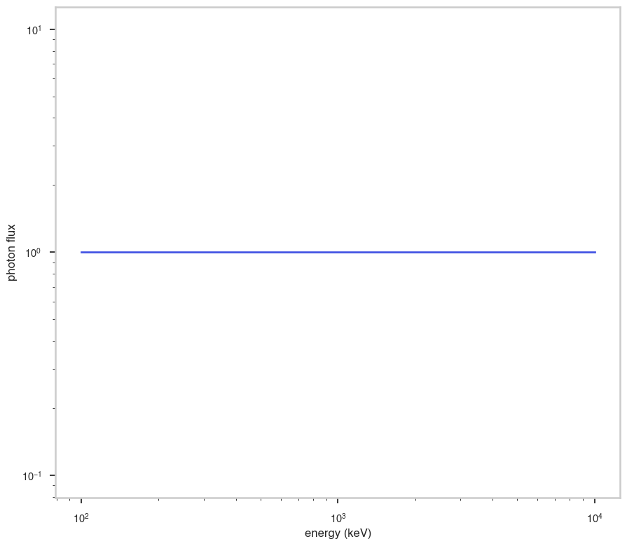
fig, ax = plt.subplots()


ax.plot(energy_grid, func(energy_grid), color=blue)

ax.set_xlabel("energy (keV)")
ax.set_ylabel("photon flux")
ax.set_xscale(x_scale)
ax.set_yscale(y_scale)
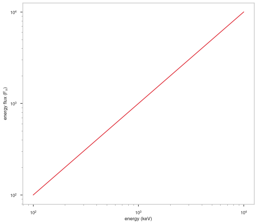
F\(_{\nu}\)
The F\(_{\nu}\) shape of the photon model if this is not a photon model, please ignore this auto-generated plot
[7]:
fig, ax = plt.subplots()

ax.plot(energy_grid, energy_grid * func(energy_grid), red)


ax.set_xlabel("energy (keV)")
ax.set_ylabel(r"energy flux (F$_{\nu}$)")
ax.set_xscale(x_scale)
ax.set_yscale(y_scale)
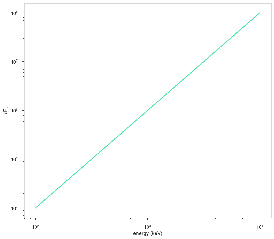
\(\nu\)F\(_{\nu}\)
The \(\nu\)F\(_{\nu}\) shape of the photon model if this is not a photon model, please ignore this auto-generated plot
[8]:
fig, ax = plt.subplots()

ax.plot(energy_grid, energy_grid**2 * func(energy_grid), color=green)


ax.set_xlabel("energy (keV)")
ax.set_ylabel(r"$\nu$F$_{\nu}$")
ax.set_xscale(x_scale)
ax.set_yscale(y_scale)